Your cart is currently empty!
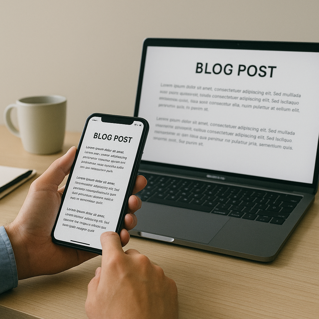
What’s the best way to format blog posts for mobile?
•
Why Mobile Formatting Matters More Than Ever
With mobile devices accounting for over half of global web traffic, blog post formatting must prioritize mobile-first design. Readers expect fast-loading, easy-to-read content that adapts seamlessly to their screens. If your blog isn’t optimized for mobile, you risk high bounce rates, poor user experience, and lost SEO opportunities.
Key Principles of Mobile-Friendly Blog Design
Formatting blog posts for mobile isn’t just about shrinking content to fit a smaller screen. It’s about rethinking layout, readability, and user interaction. Here are the core principles:
- Responsive Design: Use a responsive theme or framework that automatically adjusts layout elements based on screen size.
- Readable Typography: Choose legible fonts with appropriate sizing (16px or larger) and sufficient line spacing.
- Touch-Friendly Elements: Ensure buttons, links, and interactive elements are easy to tap without zooming.
- Fast Load Times: Compress images and minimize scripts to reduce page load time on mobile networks.
- Clear Visual Hierarchy: Use headings, subheadings, and spacing to guide the reader’s eye.
How to Structure Blog Content for Mobile Readers
Mobile users scan content differently than desktop users. They prefer bite-sized information, clear headings, and visual cues. Here’s how to structure your blog post effectively:
- Start with a Hook: Grab attention with a compelling introduction that highlights the value of the post.
- Use Short Paragraphs: Limit paragraphs to 2–3 sentences to improve readability on small screens.
- Break Up Text: Use bullet points, numbered lists, and block quotes to create visual breaks.
- Insert Subheadings Frequently: Divide your content into logical sections using descriptive
<h2>and<h3>tags. - Use Bold Text Strategically: Highlight key phrases or questions to help users skim effectively.
Best Practices for Readability on Small Screens
Readability is crucial for mobile blog posts. If your content is hard to read, users will abandon it quickly. Follow these best practices:
- Choose Mobile-Friendly Fonts: Sans-serif fonts like Arial, Helvetica, or Roboto are easier to read on screens.
- Use Adequate Line Height: A line height of 1.5 to 1.75 improves readability by preventing text crowding.
- Maintain Contrast: Ensure sufficient color contrast between text and background for accessibility.
- Avoid Justified Text: Left-align your text to prevent uneven spacing and improve flow.
- Use White Space: Don’t cram content. Let your design breathe with generous padding and margins.
Optimizing Visual Elements for Mobile Devices
Images and videos can enhance your blog post—but only if they’re optimized for mobile. Here’s how to do it right:
- Use Responsive Images: Implement
srcsetattributes or CSS to serve appropriately sized images for different devices. - Compress Media Files: Use tools like TinyPNG or WebP formats to reduce file size without sacrificing quality.
- Center Images: Align visuals to the center to ensure they display well on narrow screens.
- Use Captions: Provide context for images with short, descriptive captions.
- Limit Embedded Media: Avoid overloading your post with videos or interactive elements that may slow down mobile performance.
Common Mistakes to Avoid in Mobile Blog Formatting
Even experienced bloggers can fall into formatting traps. Avoid these common pitfalls:
- Overusing Pop-Ups: Intrusive pop-ups can frustrate mobile users and hurt SEO rankings.
- Neglecting Testing: Always preview your blog post on multiple devices and browsers before publishing.
- Using Fixed Widths: Avoid fixed-width containers that don’t scale on smaller screens.
- Ignoring Load Speed: Heavy scripts, unoptimized images, and excessive plugins can slow down your site.
- Skipping Accessibility: Ensure your content is accessible to users with disabilities by using alt text and semantic HTML.
Tools and Plugins to Help Format Blogs for Mobile
Several tools and plugins can simplify the process of mobile optimization:
- Google Mobile-Friendly Test: Analyze your blog’s mobile usability and get actionable suggestions.
- AMP (Accelerated Mobile Pages): Create lightweight versions of your blog posts for faster mobile loading.
- Responsive WordPress Themes: Choose themes built with mobile-first design principles.
- Page Builders: Tools like Elementor or Divi offer drag-and-drop interfaces with mobile preview modes.
- Image Optimization Plugins: Use Smush or ShortPixel to automatically compress and resize images.
Final Thoughts on Mobile Blog Optimization
Formatting blog posts for mobile is no longer optional—it’s essential. By focusing on responsive design, readable content, and optimized visuals, you can create a seamless mobile experience that keeps readers engaged and improves your search rankings. Remember, mobile users are often on the go. Make their experience effortless, fast, and enjoyable.
Powered by: aiContent.live
Leave a Reply